The aroma of freshly brewed coffee is a universal invitation to start a new day. Whether it be a coworker, an office employee, construction worker, delivery person, police officer, student or simply someone who needs a little pick me up, being a part of peoples daily lives is an incredibly rewording part of being a Barista.
I am a huge coffee enthusiast and thought it would be fun to do a coffee data analysis project.
I found a sample dataset for coffeeshop sales here.
This dataset consists of the following tables:
sales_reciepts
dates
customer
generations
pastry inventory
product
sales_targets
sales_outlet
staff
First I'm going to take a look at the customer table to get to better know our customer base.

From the distribution of customers home stores I can see store 8 has noticeably less customers than stores 3 and 5. Maybe we should look into figuring out why? Or maybe we should run more promotions at this store or consult with the marketing team on how to attract more customers to this store.
And since this data belongs to the month of April 2019, the gap of customers having joined in 2019 compared to previous years is understandable.
I want to take a closer look at the distribution of age and gender.

It seems like many of the younger customers appear to have not disclosed their gender compared to older customers who have mostly identified as male or female.
This can also be shown in the chart bellow:

I wonder whether this might effect business strategies but it is definitely interesting to see.
From this chart we can tell the largest group of customers belongs to the Millennial generation, and that Gen Z has the smallest representation. However we should keep in mind Gen Z being the youngest generation, may not be in their prime coffee drinking age quite as much as the other generations.
Lets see if this distribution varies across stores.

For store 3 there seems to be a larger gap between the Gen Z customers and older customers. And for store 5 millennials make up an even larger part of the customer base compared to the other two stores.
For the Baby Boomer and Gen X generations, the number of customers who have not disclosed their gender is relatively low.
For the Millennial generation, while the number of males and females is somewhat balanced, a significant number of customers have not disclosed their gender.
Most notably, in the Gen Z generation, the number of customers who have not disclosed their gender is higher than those who have, confirming our earlier observation about younger customers.

Maybe looking into the neighbourhood and location of each store could give us some more insight into why this might be. Is store 5 in an area where a lot of younger people live? If so how can we use that to increase sales? Is store 8 in a less populated area than the other stores? What could be the reason for less customers choosing store 8? And how can we fix that?
So this a map of the branches we're comparing and their neighbourhoods.

Looking at the location of the stores, with store 5 having the most customers I think it was a great decision to have store 6 close to 5 since it seems to be doing the best of the 3 stores we have data on.
Something interesting we can do in Tableau is add background data layers to the map and see whether there's a difference in population or demographic for the 3 stores.
The information for the data layer information on Tableau is based on 2018 data and I'll set the level of detail to census tract.The dataset I'm using is for April 2019 so I think it's ok to assume it wouldn't have changed vastly since then.


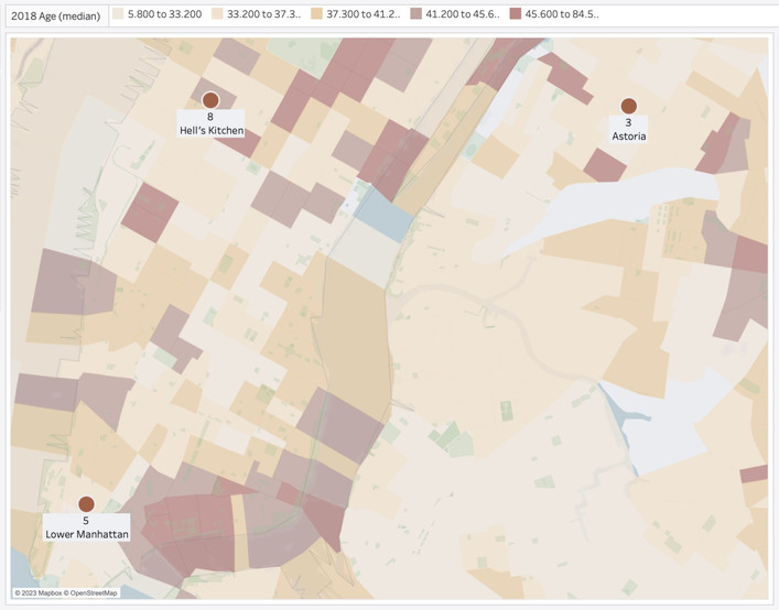


Household Income Comparison: Store 5 seems to be in a neighbourhood with a relatively higher household income compared to stores 3 and 8.
Median Age Comparison: Store 8 seems to have a slightly higher median age than the other two stores. Which could possibly be why it has less Gen Z and Millennial customers, however store 8 also has less Baby Boomer and Gen X customers.
Population Comparison:We can also see that store 8's neighbourhood has relatively the same population as store 5 and a higher population than store 3.
I would recommend to aim for getting more customers for store 8, since based on the population and income of the area there seems to be potential for a higher count of customers. (There are definitely other factors to consider however for the purpose of this project I'm not going to over complicate it.)
Now, lets look at how these 3 stores are doing in terms of sales:

Either they are all doing extremely well and overachieving or I'm comparing the wrong sales values.
Based on the wholesale price of products and the amount sold I can calculate the cost of goods sold (COGS), as well as the money lost on pastry waste and subtract those from our initial sales.
I have no information regarding other costs such as rent, staff payrolls, bills, any costs of maintaining equipment or any other cost that would be required to calculate the actual gross sales. So is this comparison going to be completely accurate? No. But can be gain a bit of insight from it? Maybe.


Sales Outlet | 3 | 5 | 8 |
Revenue | $77,213.23 | $76,894.47 | $79,528.25 |
COGS | $28,488.88 | $28,383.14 | $30,508.59 |
Waste Costs | $1,109.32 | $1,193.10 | 1,211.04 |
Adjusted Sales | $47,615.03 | $47,318.23 | $47,808.62 |
Sales Target | $18,000 | $25,000 | $22,500 |
Looking at the adjusted sales, all three stores seem to roughly have very similar sales. Store 5 had the highest Sales Target however reached the lowest amount of sales between the three stores. So I'd recommend looking further into the why. Was the Sales Target calculated inaccurately or did we fall short in predicted sales and if so what is the reason and how can we fix it?
Something else worth noting is the fact that even though Store 8 had a relatively lower customer count than the other two stores, it has an adjusted sales amount similar to the other stores. The count of customers mentioned is the count of customers that have chosen store 8 as there home store. Let's look into two possible reasons for this outcome:
A. Store 8 has a relatively similar number of customers to the other two however not all the customers contributing to the sales are signing up, or have chosen store 8 as their home store which would be why they aren't included in the customer count.
Is store 8 in a location where you would have many customers but not necessarily returning customers? Near a tourist attraction, close to a bus stop or subway station compared to a residential area where you'd expect to have more regulars. If so we'd focus on appealing to first time customers. So basically try to get the most sales out of that first encounter rather than build a foundation for sales to come. For example having a punch card that gets you a free drink after buying coffee 5 times wouldn't help for this customer base
B. Store 8, assuming all three stores share a similar ratio of customers coming in and those signing up and or choosing said store as their home store, actually has less customers coming in, however each customer is coming in more frequently or spending more per transaction.
In this scenario it seems we have a smaller yet loyal customer-base, however we could use some improvement in getting more people in the door.
I might do a separate analysis on the customers however for the sake of this current project I'm not going to get into it any further.
Store 3 with it's Target goal of $18,000, which is the smallest Sales Target, and considering the $4,500 difference with the second smallest Sales Target; it seems Store 3 has done quite well in reaching about the same sales as the other two stores that had a higher Sales Target. It can't hurt to look into that as well and see if we can determine the factors leading to the success of Store 3 in order to be able to replicate them.
All three stores have a waste cost of close to $1,100 and compared to the Sales Targets of $18,000-$25,000 it is definitely significant enough to look into ways of reducing it.

The Start Of Day quantities have been increased for the middle of April, and even though Sales have risen, Waste has also noticeably increased with the increase in Start Of Day quantities and slowly decreased throughout the month.
If we were to look at the daily waste for three products with the highest waste;

we'd notice how much higher the waste is for Ginger Scones. The Ginger Scone waste is decreasing however it spikes again at the end of month. also worth noting even with the large decrease in Ginger Scone waste it is still the top contender to the waste on throughout the entire month.
In the bar chart below, the black line represents the Start of Day Quantities, and each bar is the quantity sold on that day. The grey shaded areas each represent %80, %60 and %40 of the Start of Day Quantities. So this gives us somewhat of a visual as to how much we could have reduced the Start of day quantities without harming sales.
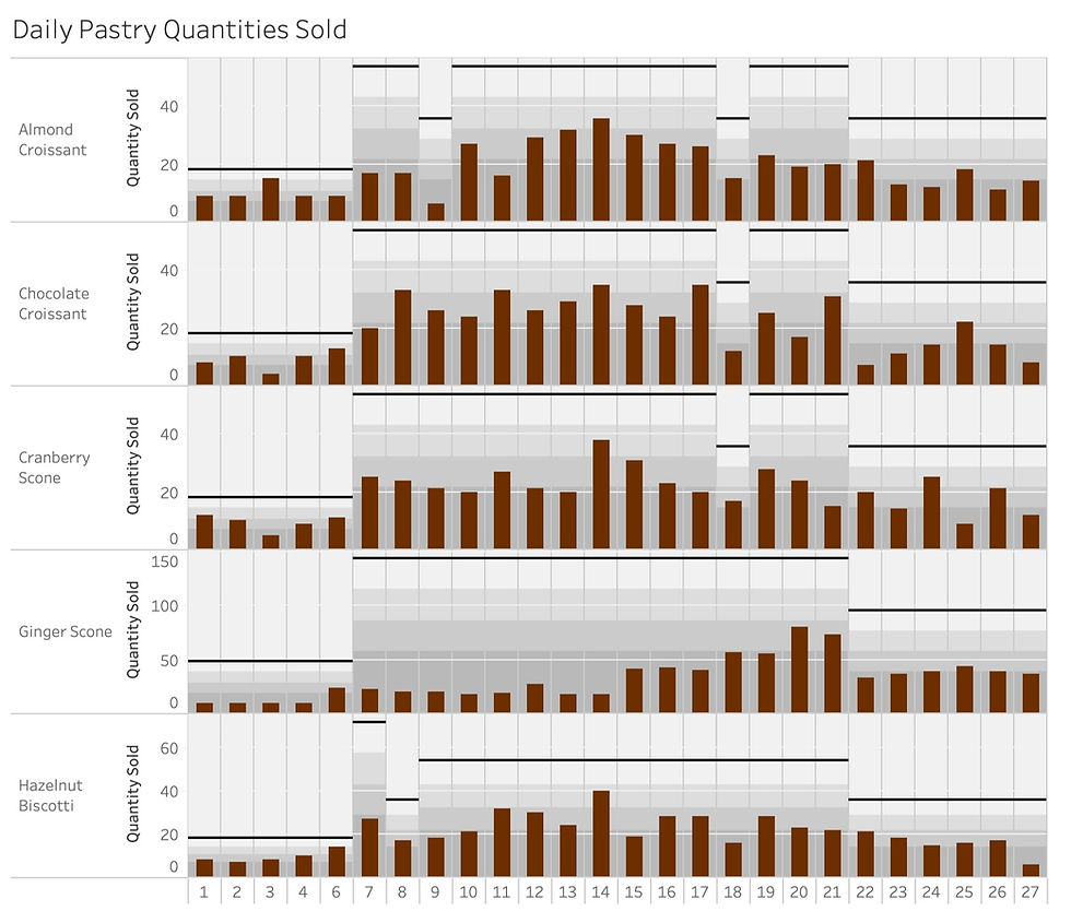
So based on this I'd recommend reducing each pastry by the following percentages, and also I'll calculate how much money we would have saved had we used these reduced start of day quantities. For some of the Pastries, by reducing the start of day quantity by the recommended percentage we might have lost a few sales on 1 or 2 days, so I will factor that in.
| Ginger Scone | Cranberry Scone | Hazelnut Biscotti | Almond Croissant | Chocolate Croissant |
Recommended to reduce by | %60 | %40 | %40 | %30 | %30 |
Amount Saved | | | | | |
I'll also look at Sales by Product type:

For Merchandise, Add-ons and Whole Beans/Tea we don't have any sale data for the first week and the last 2 days of the month. I wonder if they were only available during the middle of the month? Beverage Sales do seem to drop during the middle of the month so maybe it was an attempt to boost sales during that period? (Beverage Sales had already started to decrease before the addition of these 3 categories so it can't be the cause of the drop in Sales.)

For the Whole Beans/Tea category the profit margins seem quite low so I wouldn't necessarily focus on trying to sell more of these items. (However one thing to note is that, assuming these products do not require preparation, they also do not require staff to spend much time on them.)
Merchandise probably doesn't have a shelf life and seems to have a better profit margin. Doesn't seem to be selling well so I would like to see why and try to raise sales in this category.
The Beverages category has the highest sales and is to be expected. So running a Promotion that includes a Coffee or a Tea with an item from a different category that has less sales could help raise sales for the other categories.
And as for the Add-on items although the sales aren't very high, they aren't costing us much, they don't take any extra time for staff to incorporate into a drink/order and since they usually have a relatively low price, customers might be more inclined to accept to add them to their order upon suggestion.(Hence the name Add-on:)
Comments